
Any time of year, it’s great to get a freebie right? I’m hoping you’ll enjoy my little gift for you today in the form of a free “step by step” on a recent painting that’s gotten quite a bit of interest. I call it “Splash Buddies” and I hope you enjoy the tutorial.
I also did an interview this month with a national radio show! It was amazing to me to think that my story might be inspirational. After all, I’m not that special. I came to art late in life, and teach a limited number of students. But THAT is just what Joyce thought was at the heart of my story.
She aims her Radio show at folks who are looking at mid life as a time of change and opportunity. It’s always my goal to encourage students and fellow artists to explore the joys of painting, so I agreed to the interview. To be honest, I was a kinda nervous, but Joyce is so nice that it was like talking to a good friend over a cup of coffee. After listening, I hope you’ll agree that it’s never too late to move in the direction of something you might only have dreamed about…
Here’s the link to the audio recording of the program (it’s about 40 minutes if you fast forward through the commercials: https://rebeccazartist.com/videos/
Now…for a Tutorial on my new painting!
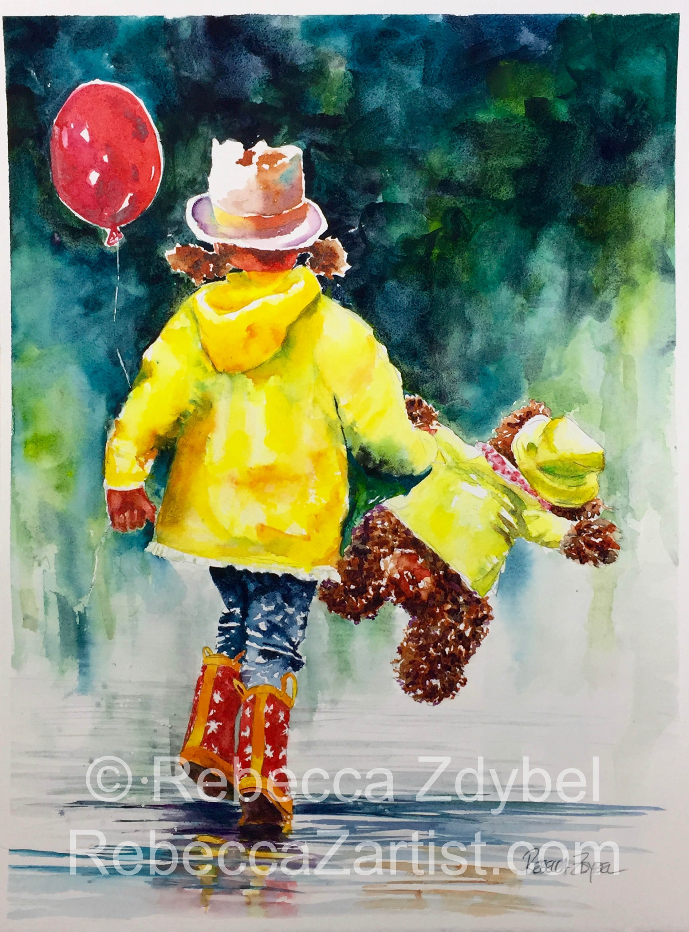
20×15 Watercolor on paper $550 (30% goes to charity =)
This new painting is called “Splash Buddies”. It was so much fun to paint and I’d like to take a moment to walk you through how it was done step by step. I love seeing these kinds of posts from other artists, so here you go! My way of saying thank you for subscribing to my blog. <3
Inspiration: First, you need to know that it was inspired by my admiration for Bev Jozwiak’s style of painting. It’s fresh and bold, and that’s two qualities I love in a watercolor painting! As an artist, I am constantly looking around for inspiration and I think we all should be doing so. In life and in art, right? I painted the painting below as my version of her beautiful lesson called, “A Style of Her Own”. If you like this kind of work, you may want to check her out (Bevjozwiak.com).
Watercolor on paper “Beverly Style” after Bev Jozwiak 22×15 (original $500- prints available) 30% goes to charity
Interpretation: After completing that painting and loving it, I was determined to take her lesson and make it my own. I searched for photos online that I loved and purchased the rights to use this one from Fotolia.com. It’s important to make sure that you use original photos or make sure you have the rights to use them.
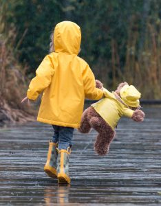
Drawing: Then I came up with a drawing that combined elements of both in a way that I loved. I took the head and the idea of carrying a balloon from the first painting. I added the gesture and the teddy bear from the purchased photo. The combination looked like this:
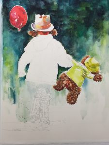
stage 1
Color Choices: I decided to use the color inspiration of dark greens and yellows from my reference photo. This was done using a combination of dark blue, turquoise, and a yellow green. I thought the complimentary color of the red balloon would be a nice way to move you up and into the painting. To carry your eye through the painting, I used the red of skin tones and some reddish tones within the teddy bear to move you in a diagonal fashion through the piece from left to right. Using color harmonies for yellow, I created a sense of shadow and light on the bear’s jacket, opting to lean him to the cool side of yellow (more toward green). My plan was to make him cooler and her warmer. As you can see, she leans more toward the orange side of yellow and the greenish tones that dominate the bear’s coat are reserved for shadows in her jacket.
Background: I also worked on the background as I went along. This is a great plan for making your figures appear as part of their landscape and not like paper doll cut-outs. This is advocated by many teaching artists, including Don Andrews and Bev Jozwiak. You’ll notice colors from the figures are echoed in the background and colors from the background find their way into the figures (generally by way of shadows). The background is worked abstractly and directly with a gradual transition from dark to light.
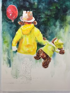
Stage 2
Design Considerations: After painting the jackets and the backgrounds I chose to put her in blue jeans and remain true to my photo reference. I made this choice so the legs would stand out more from the background. It also continued the darks from the background and formed a nice inverted triangle which gives the composition some energy. Inverted triangles are inherently unstable, and are a great way to point attention to something…in this case, her boots.
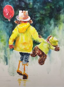
Stage 3
Reflections and Shadows: At this point, I needed to decide what color to paint her boots. After some thought and some discussions on Facebook (thanks to those of you who weighed in!) I made a decision to paint them red. In order to allow the white of the paper to move through them, I kept the patterns within the boots white. After painting the boots, and while I still had the paint mixed in the palette, I went ahead and put in some initial reflections and the shadows of her boots. It’s always a good idea to paint the thing, before you paint the reflection of the thing (a quote I thank Steve Rogers for gifting me with <3). Furthermore, I take it a step further and say this,” Paint the reflection of the thing while you still have the paint color mixed on your palette.”
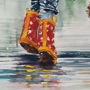
Detail of boots and reflections
Reinforcing the Story: Paintings with figures as the main subject often benefit when you feel a story attached to them. Adding some reflections and splashes helped to create the story I wanted to tell. In this case, a title was evolving in my head. These two characters looked like Splash Buddies to me, so that’s the story I wanted to reinforce. With both of them in raincoats and a drippy style of background, it seemed like a no-brainer to paint a wet surface with some drips and water droplets. I created some by dripping on masking fluid and others with splashes of watercolor. That way the drops were illustrated both positively and negatively.
When painting something similar, it’s always a good idea to look for ways to avoid making the same mark over and over. If you’re boring yourself, odds are that you will bore the viewer.
Final Steps: I lifted the masking fluid, made final adjustments to edges and did a little bit of editing and glazing to pump up the color here and there. You’ll notice that some of the colors in the reflections on the ground reflect colors from the upper portion of the painting. Reflections and shadows are great vehicles for color transportation. Think about using them as a means of injecting incidental colors that can help the viewer’s eye to move around in your painting…sort of like connecting the dots.
All in all I’m really happy with the final result and hope you’ve enjoyed this explanation of the painting. I owe a great debt to Bev Jozwiak for the inspiration, and after consulting with her, she is ok with the fact that I cut off the head of her little girl for my painting. Haha, I can certify that there was no bloodshed, just fun!
20×15 Watercolor on paper $500 Prints available- contact me for prices
If you enjoyed this blog, I’d appreciate your comments. It’s a small favor you can do for me. As I understand it, the search engines that direct people around the internet love when readers interact with a website. It makes them think its possibly an interesting site, and they raise the visibility of the site accordingly. It makes sense, and that’s why websites are always asking you to interact with them. I’m no exception, but I try not to be annoying about it. I’ll try to respond to whatever you’d like to share with me… questions, and even suggestions. It’s always a pleasure to hear from you!
With love and paint stained fingers,
Rebecca
Art Classes with Rebecca :
Join me for art classes soon! Schedule via this link:
Thank you – I know the kind of energy and motivation it takes to produce a blog post and you are so generous to do this for us! Great easy to follow tutorial – gifted teaching. I have forwarded it to some painting buddies. Going up to paint …
Thanks Pat! So nice to know you felt like my descriptions were understandable. I always hope so, but the feedback is so helpful. I hope it helps inspire some painting! Love to you and yours ❤
Thank you Rebecca – I love this painting and you are so generous to share your tutorial. I may try this with my granddaughters in mind?. I am proud to know you as a very talented artist, wonderful teacher and especially a friend. I am getting ready for paint stained fingers……
I love paint stained fingers! It’s the sign of a day well spent! Thanks for checking in, and Happy New Year! ? ❤️
Thank you for sharing your process It is so helpful to get insight into your creative genius! You are so talented and a truly gifted teacher. I look forward to class each week!
You’d be a gift in any instructor’s class, but I’m so glad to have you in mine! Can’t wait till we play in the paint together again. Hopefully very soon! ❤
Rebecca, I truly enjoy reading your blog and especially your process posts. I appreciate the detail you provide and always learn something! This week’s main tip–“paint the thing before the reflection of the thing.” Seems like a no-brainer, but always good to be reminded.
I’m so happy to hear that the blog was helpful to you Maggie. It’s funny how little ideas like, “painting the thing before you paint the reflection of the thing” can be such lightbulb moments! I had the same feeling when it was shared with me. Thanks for sharing the journey and taking the time to check in. ?