
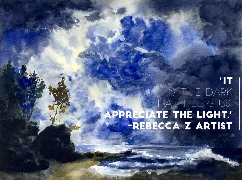
Paintings with PUNCH are attention getters! What gives a painting PUNCH? More often than not, those paintings explore the full range of light and dark and create drama through CONTRAST. However, it’s not always apparent how to get that kind of drama in the paintings you try to create in your home studio. One of the most powerful ways to pack a punch and add drama to your paintings is by understanding how to harness that power of contrast. Today let’s focus on the dark value end of the spectrum.
When critique time rolls around, I always begin my assessment of a painting with an evaluation of VALUE. What is value? It’s Light and Dark and how it’s used for contrast. One of the main complaints I often have with many watercolors is the lack of strong values in their composition. Often, it seems like the dark values in watercolor are not dramatic enough. Without those darkest darks, you’ll find that light values don’t sparkle. I call this being stuck in Mid-“Dull” Value. If this could describe your paintings, you’re not alone, and I might have something to help give your paintings a boost!
How about this for some art philosophy? Begin your “self-assessment” with an examination of your VALUES.
(There’s almost a lesson for life in there, don’t you think?) What it really means in practical terms is that if there is a problem with a painting, more often than not the problem is one of value.
In my work, using a transparent palette to create dark value can be tough. Sometimes I think I’m going in with something dark, only to watch my wet colors become lighter as they dry. Sound familiar? Value is tricky, especially in watercolor where the intensity of hue often lessens as the color dries. This can be a real frustration for watercolorists! If you paint in watercolor, I’m sure you’ve had the same experience. Even with repeated glazing, it’s not uncommon to find the colors you once thought were dark, are still not dark enough.
Do you creep up on your darks, sparing the whites and moving from middle value slowly up the value scale to the darkest darks? You’re not alone! This is a classic watercolor strategy. As we build value relative to the white of the paper, our middle values will often “feel” darker than they are, because all we are comparing them to is the white of the paper.
Here’s a little hint I recently learned from Steve Rogers:
Try tucking your darkest dark into your painting EARLY in the development of your piece. That way, as you develop the painting you’ll be working toward that dark value and not just randomly sticking it in later in the painting.
Putting dark value in early will force you to build your painting from the beginning with those very dark colors in mind. From there, everything will have to end up somewhere in between. Steve predicts this method will help make it easier to support those darkest darks with strong middle values and light middle values as part of the painting from early on. These middle values are essential to forming the needed bridge between the white of the paper and your darkest values.
How to Mix Dark Colors in watercolor?
Some colors will never be dark, no matter how much color you put down. This is important to remember as you set out to create dark colors.
- For Example- Cobalt Blue will never be more than middle value, even if you load up the paint and paint with it straight on the painting from the tube.
- No Yellow will ever be a dark value unless combined with a power color in a mixture.
SO- If you want to mix a dark, reach for your POWER COLORS, but avoid BLACK or GRAY. Blacks and grays tend to look lifeless, unless they are mixed with other pure colors. To create darks that aren’t dead looking, use mixed colors to form darks. Think of your darks as color opportunities!
Hints for interesting Dark Value:
- Squeeze out some fresh pigment! That way you’ll have more pigment available to make dark color happen.
- Lay that color down strongly, while wet add a bit of warm color to the cool or cool into the warm to create color interest. Then move on and don’t keep fussing.
- USE COLORS THAT CONTAIN INHERENTLY POWERFUL DARK PIGMENTS! To get a dark dark, you need a paint color with punch! This may seem obvious, but sometimes it’s not. We don’t always know what’s in our tubes.
- Acquaint yourself with some of these combinations and see if they can’t bring some color and strength to your dark passages…
- Prussian Blue + rose= dark violet
- Prussian blue + Winsor yellow or Aureolin= Dark green
- Perylene Maroon + Ultramarine Blue= Dark Violet
- Antwerp Blue + Quinacridone gold= Dark green
- Ultramarine Blue + Burnt Sienna= variable warm Black or gray
- Ultramarine Blue + Permanent Alizarin Crimson= Dark Violet
- Ultramarine Blue + Permanent Magenta or Permanent Rose= Strong Violet
- Phthalo Green + Permanent Alizarin Crimson= Black or gray
- Daniel Smith Sodalite + Permanent magenta or Permanent Rose= Dark Granular Violet
- Daniel Smith Sodalite + Winsor Newton Burnt Sienna= Gorgeous granular Black
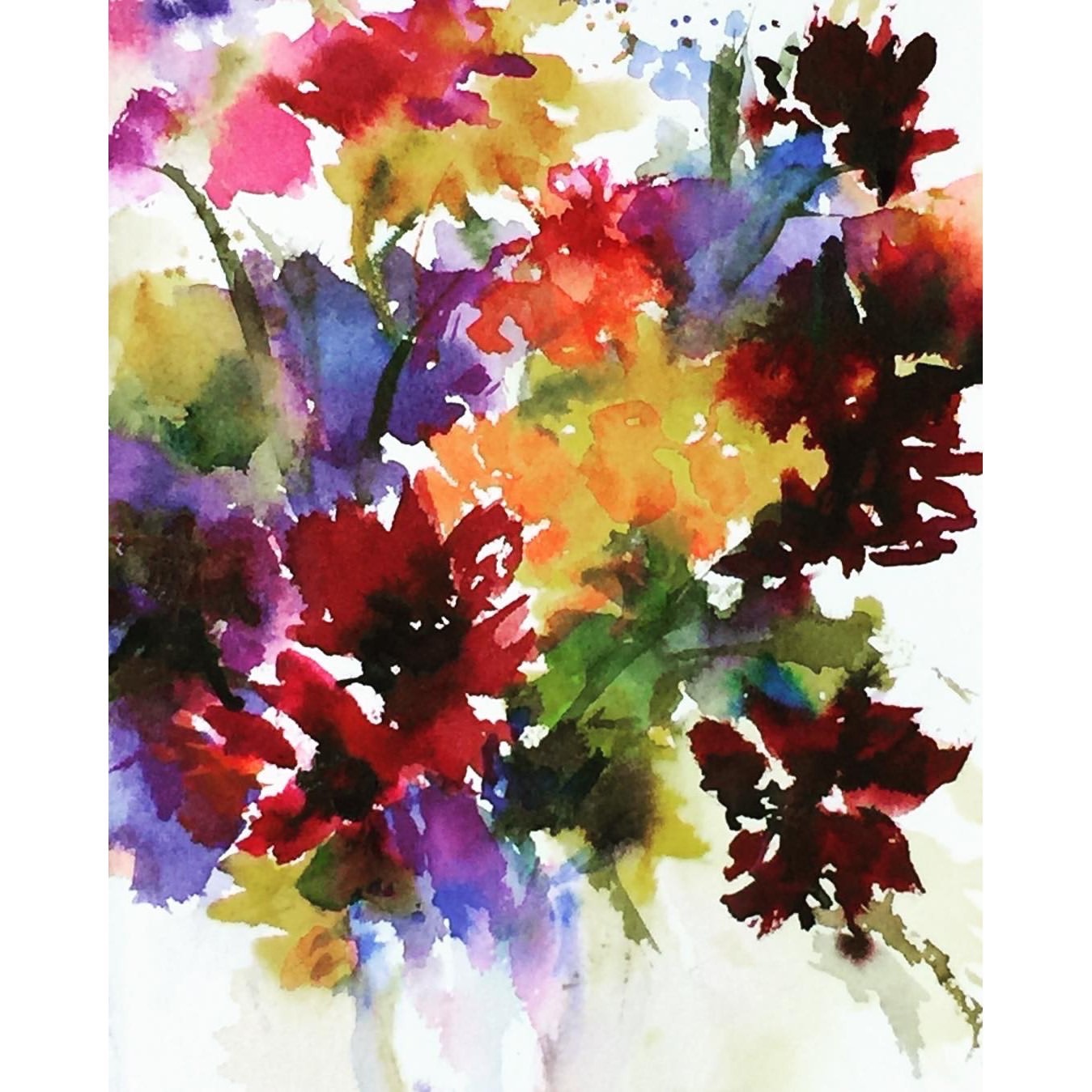
- Daniel Smith Sodalite, Holbein Leaf Green, Winsor Yellow= granular dark green (as in the painting below)
Try these color ideas out and let me know if they add some dynamic darks to your next painting. I predict they will give your future paintings some punch!
Love and light,
Rebecca Z
20×15 Watercolor on paper
Very nice paintings. Interesting about the color values and I agree with the sentiment.
Value and contrast are so important to creating drama…that’s why black and white photos can be so engaging. Thanks for your comment Nancy ❤️
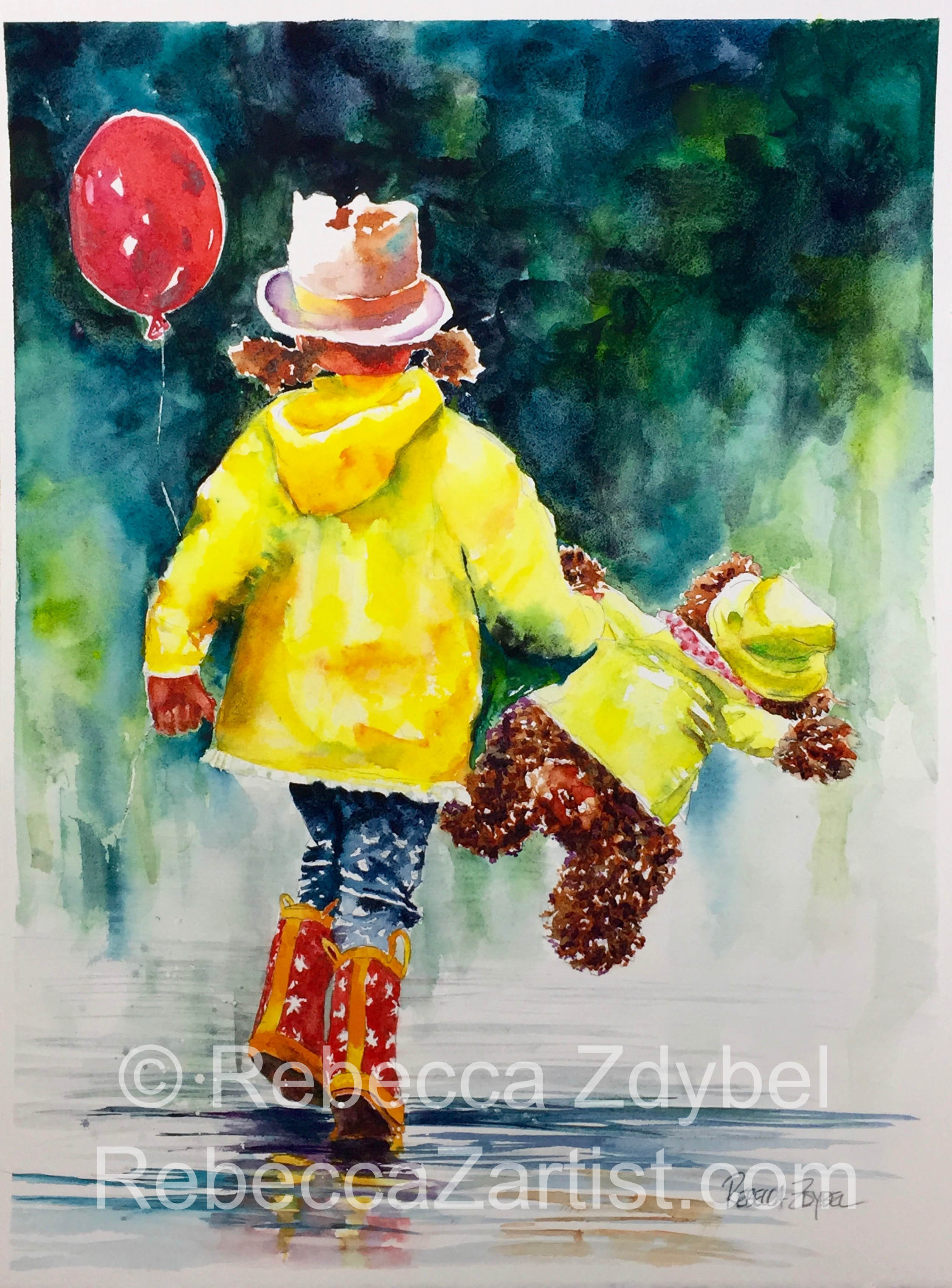
Becky, of all you paintings I love this the most! It brings out the kid in me for sure. If you ever have prints made I would love to buy one…please. What an extra happy time in your life right now! Congratulations. When is it due? Boy or girl or unknown? I hope you came through the terrible weather is safe and good shape. Nancy
That’s so nice to hear Nancy! I hope you’re kicking up your heels this holiday season. I know it’s been a rough year. Thanks For your kind comment ?
Thank you so much for your explanation on values! I’ve been trying to learn how to paint watercolors, but I want to be able to add different values to everything I paint, and I couldn’t find a teacher who knew how to do it!
I’m so glad you feel as if the blog post helped you with understanding values! I’ve really come to believe that value is fundamental to the success of our paintings. If the values are right, it can be any color. Happy painting!
Hi Rebecca,
Is there a type of watercolor paint that has stronger values?
Thanks!
Sean
Good question! Materials matter, and your best bet for strong applications of value is artist grade watercolor in tubes. These will give you the most bang for your buck 😊