

COLOR SWATCHES!
Who knew they could be so much fun and so instructive?!
Do you have paints you have never used?
Try this fun exercise and get to know your paints!
Ok, so if you’re like me then YOU LOVE COLOR! In fact, I might actually be a bit of a paint tube junkie. When I have an order for art supplies, I confess that I will buy another tube of paint to qualify for free shipping. Sound familiar? I’m sure I’m not the only one… This habit has left me with lots of paints that I know very little about.
Swatches seemed like a great idea…designers use them all the time for tools in making color choices. As artists, we are designers too. Ideally, our color choices should be thoughtful, and those choices impact the outcomes of our work. Once I decided that my goal was to make swatches for all my watercolor paints, I wondered what kind of information I should include on the swatch? After doing many hours of research, I basically realized how much I didn’t know about my colors, and how much I SHOULD know when I use a color. I’ll go into that information later.
HOW TO MAKE COLOR SWATCHES!
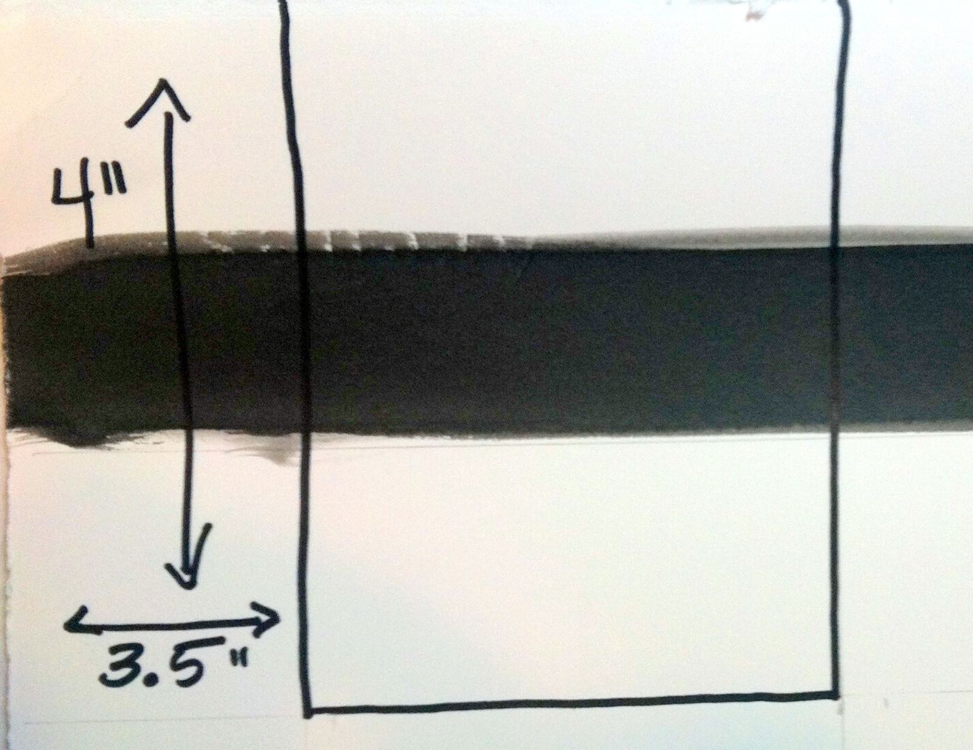
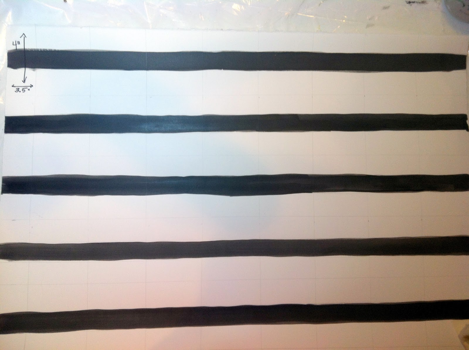
I divided my full sheet of watercolor paper into rows of swatches that were 4 X 3.5. Once the sheet was done I painted a black line through the middle of each rectangle by painting long lines of India Ink across the page with a 1″ flat. The same could be accomplished with black acrylic or a 3/4 flat. This is how it looked.
The Ink Line provides a test for Transparency. This transparency test lets you know whether a paint is opaque. If it sits on top of the black line, then it is not transparent.
 This is the information I decided to include:
- Manufacturer
- Manufacturer Paint Name
- Pigment(s) Number(s) and Name(s)
- ASTM Lightfast Rating
- Other Permanency info
- Transparency Rating
- Staining or Non/Staining
- Warm/Cool
- Granulating capacity if known
- Warnings or Stars if I loved the color
Now it was time to paint! I took each paint tube and made a strong mix of paint on my palette. I wanted a dark wash for the first stripe…not pure paint, but a very rich dark version of the color. After laying that down in a stripe which crossed the black line, I would rinse my brush and bring that brush full of water to the puddle and mix it in. With that 2nd more diluted mixture, I would make a 2nd stripe of paint which was theoretically lighter value. Again, I would rinse my brush, and bring another brush load of water to the puddle to dilute it even further. With that puddle, I would make a very light value wash. My 1/2 in Loewe Cornell one stroke brush was a great tool for this, but it isn’t a requirement. Here is a representative swatch.
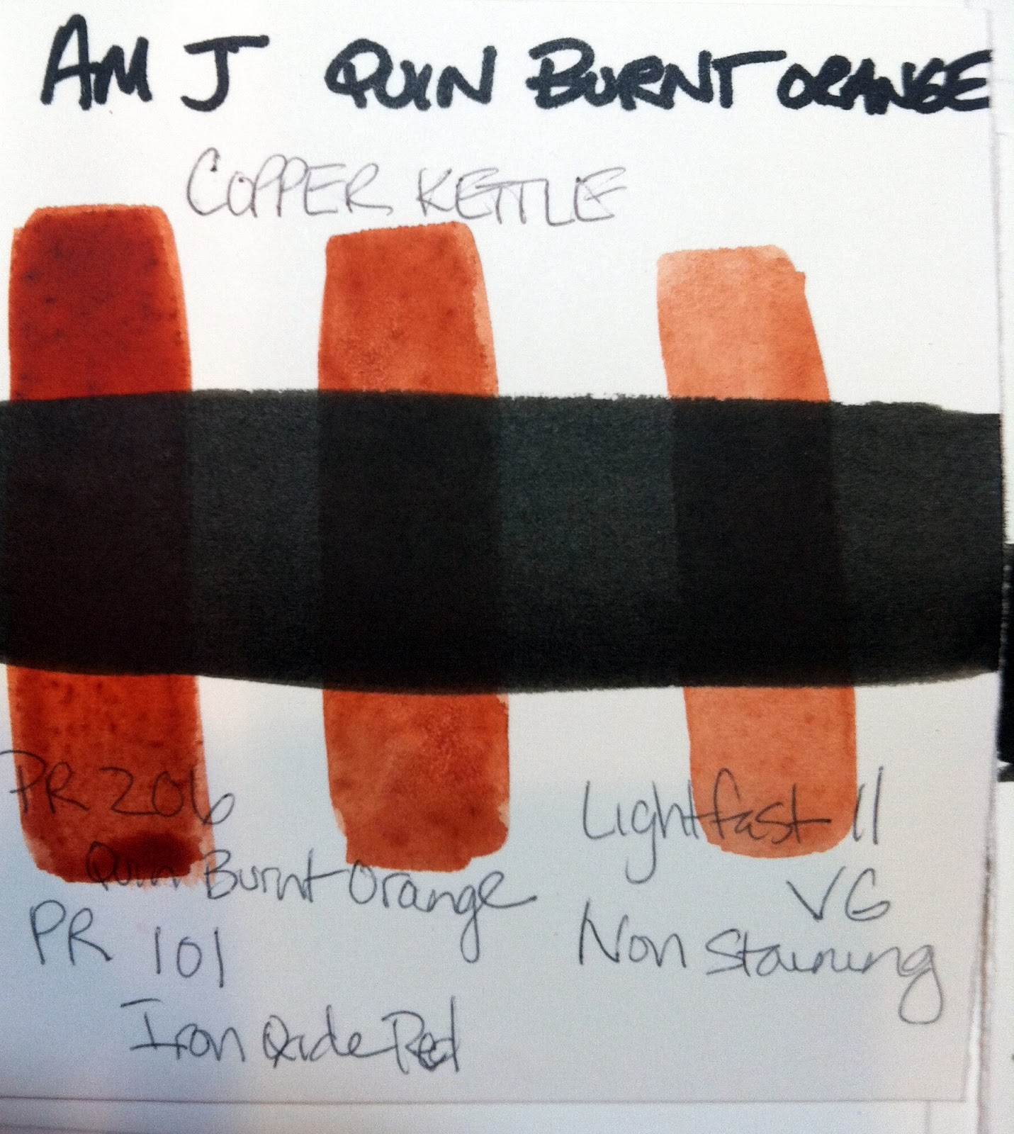 |
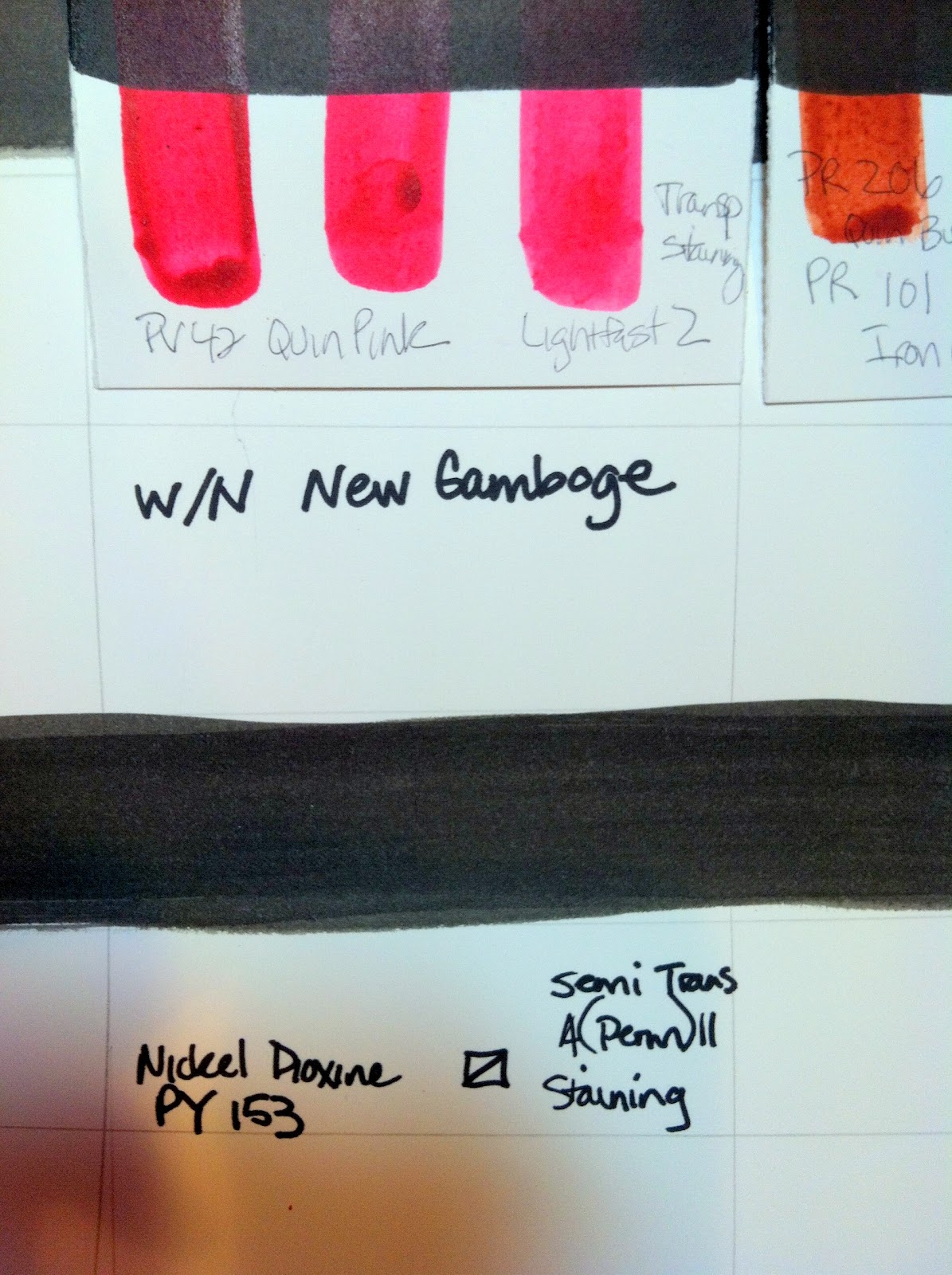
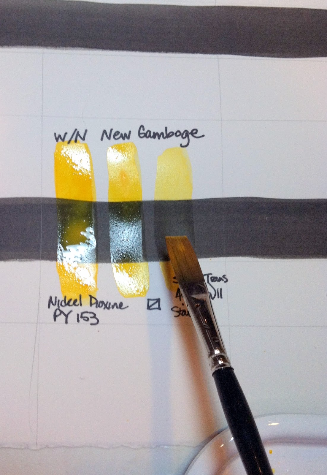
| Note the transparency of this color is evidenced by how it “disappears” behind the black line. An opaque, semi-opaque, or semi- transparent color will be visible on top of the black line. |
|
| After your page is full it might look something like this |
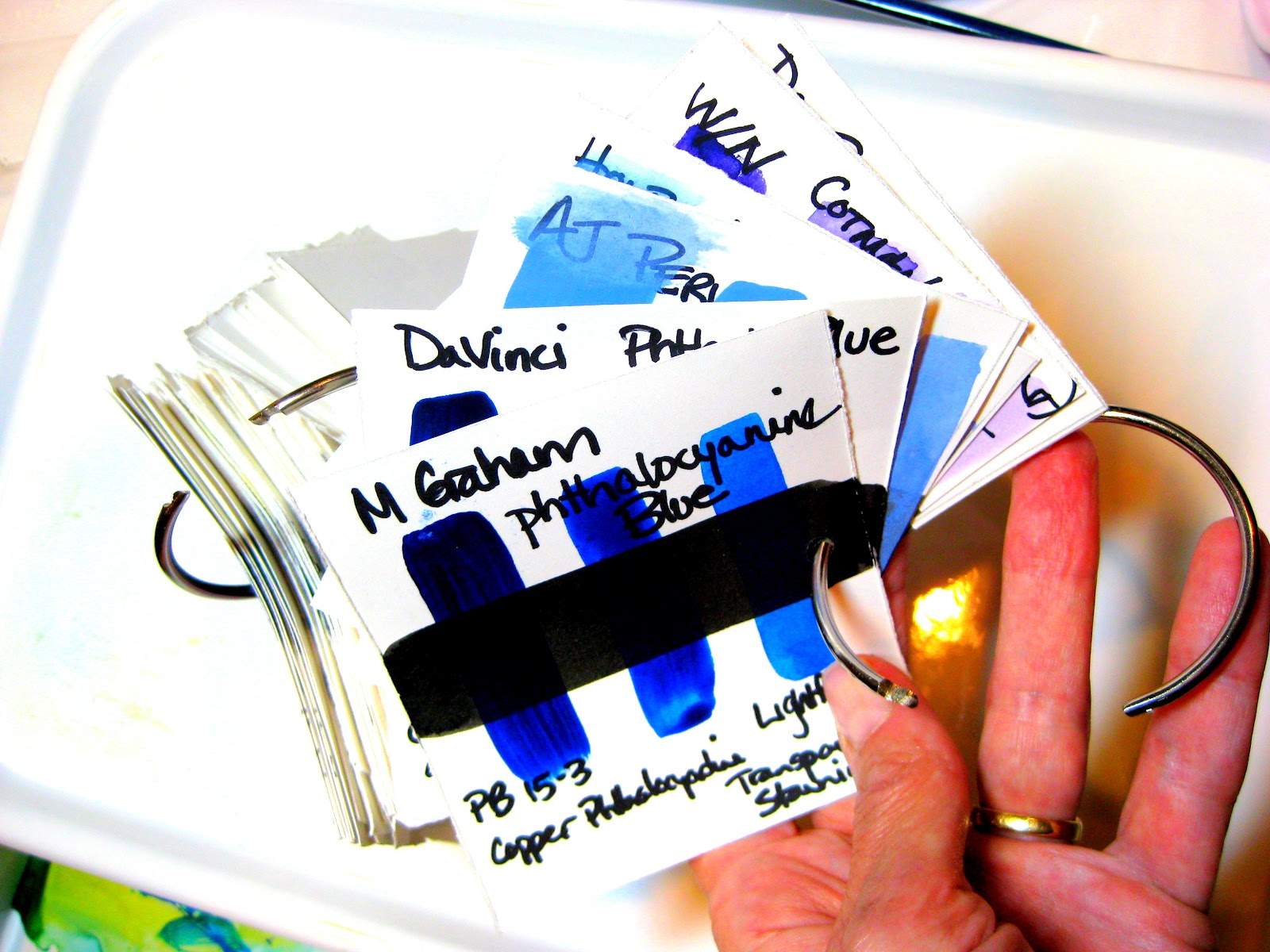
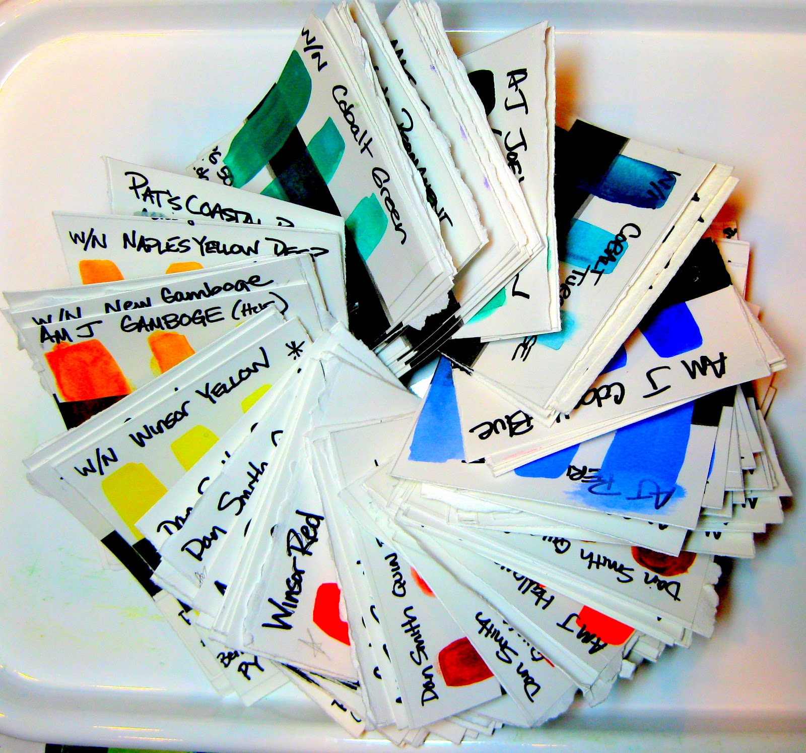
Voila! A Rainbow of
COLOR SWATCHES
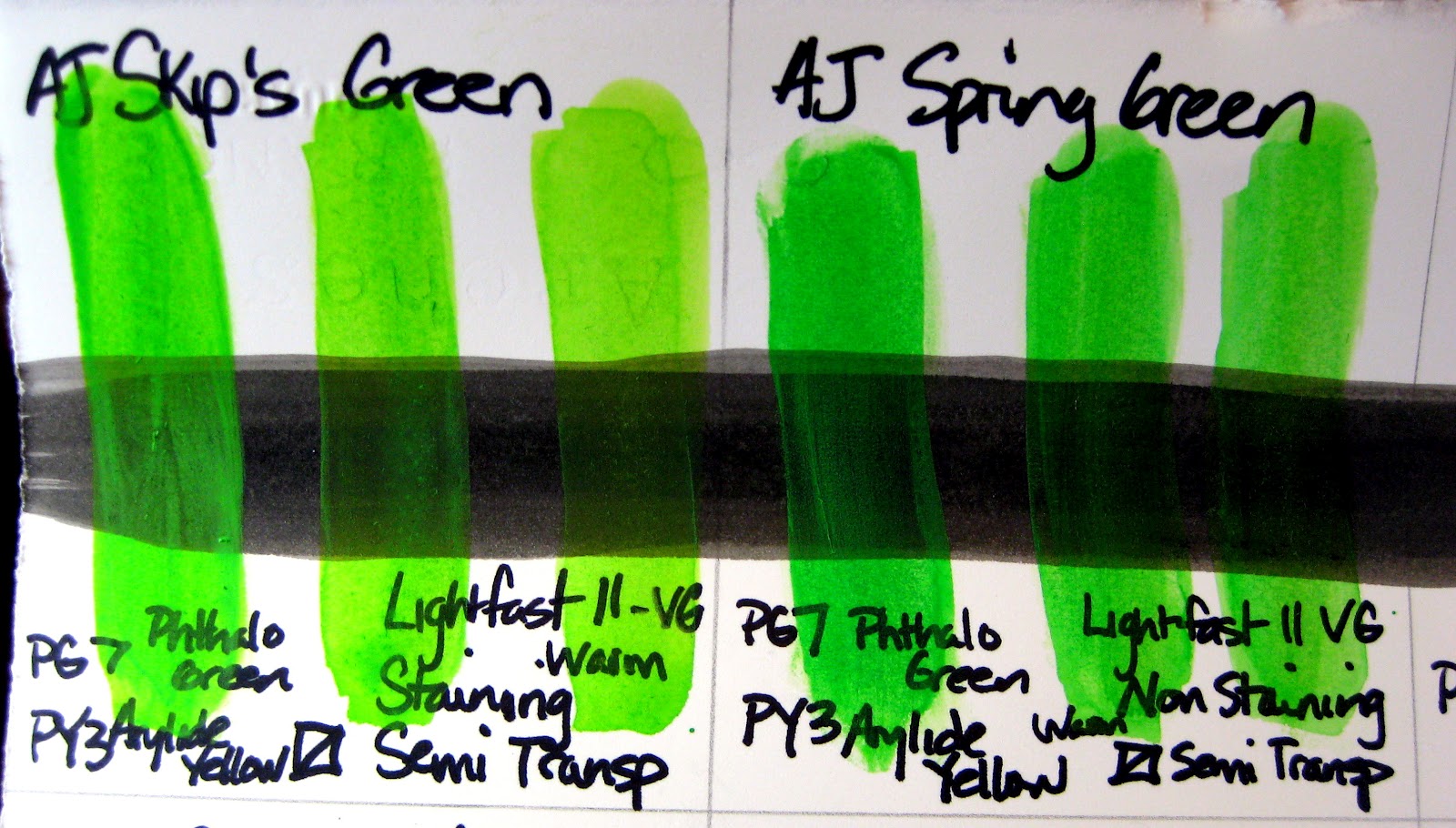 |
| Note that these paints have different names but the same pigment composition and similar color. |
Why even bother with this?
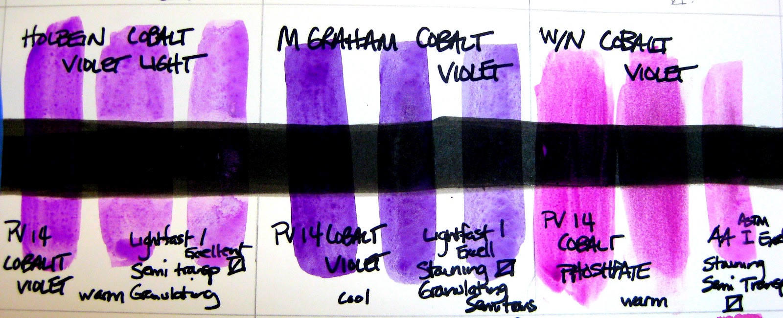 |
| Note that these very different colors all have the same name “Cobalt Violet” |
- First of all, I now feel so much more informed about the paints in my paint box! It feels good to literally be able to say, “I’ve used each of these paints and maybe have some idea of what they can do!”
- Second of all, I feel more informed about the materials I want to order and use in the future. I have some idea of the difference between my Daniel Smith paints, and my Holbein and American Journey colors. I did not find that one brand was better across the board. I did observe how wonderfully the M Graham colors kept in the tubes…that honey that they use does keep them gooey for a long time, but they can feel sticky even when they dry. I also observed that those colors with a permanency rating of less than excellent, were typically wimpier and sometimes even impossible to mix into a strong wash (e.g. W/N Rose Diore’)
- I became familiar with some paint categories and qualities that I have an affinity for…(e.g. I love the quinacridones!! They are transparent, and lovely and generally fall into the Excellent or Very Good Lightfast rating) I am less a fan of the opaque colors, but now I know which ones these are (e.g. Cadmiums and Ochres)
- Next time I order, I have a ready reference tool for what brand option or color I might want to reorder.
- I also can use these swatches a teaching tool for students in class. They are portable and beautiful to look at!
My next post will go into greater depth on the meaning of the numbers and information on your tubes and in the color charts.
The research I have done is both surprising and sometimes disturbing.
For Example: Warning if you Use Alizarin Crimson:
Did you know that the primary pigment for ALIZARIN CRIMSON is FUGITIVE and known to fade?!!!
How did I not know this? DO NOT USE PAINTS WITH PR83 AS THEIR PIGMENT. (e.g. M GRAHAM’s Alizarin Crimson) As much as I love M Graham, I cannot believe they market this pigment without a warning attached. The lightfast rating given to PR83 by some research indicates it could begin to fade in a matter of weeks if exposed to light!
More on this subject and other pigment information you need to know in future posts…
Let me know if you enjoy this project!
Feel free to share this blog post on your own blog or website, but I ask that you you include:
I found this exercise to be extremely beneficial because after creating swatches from my entire palette, I discovered that some colors were sub-standard. I had about 6 or 7 Grumbacher brands which showed up as quite dull when compared to other brands I was using. After replacing all of the Grumbacher paints with a better brand, my palette looks more vibrant. This swatch method also helps plan paintings because when using the same type of watercolor paper for my swatches, the same results are achieved on the type of paper I always use when painting a picture (as opposed to swatches seen in catalogs or from free samples on a different type of watercolor paper). –Keith