
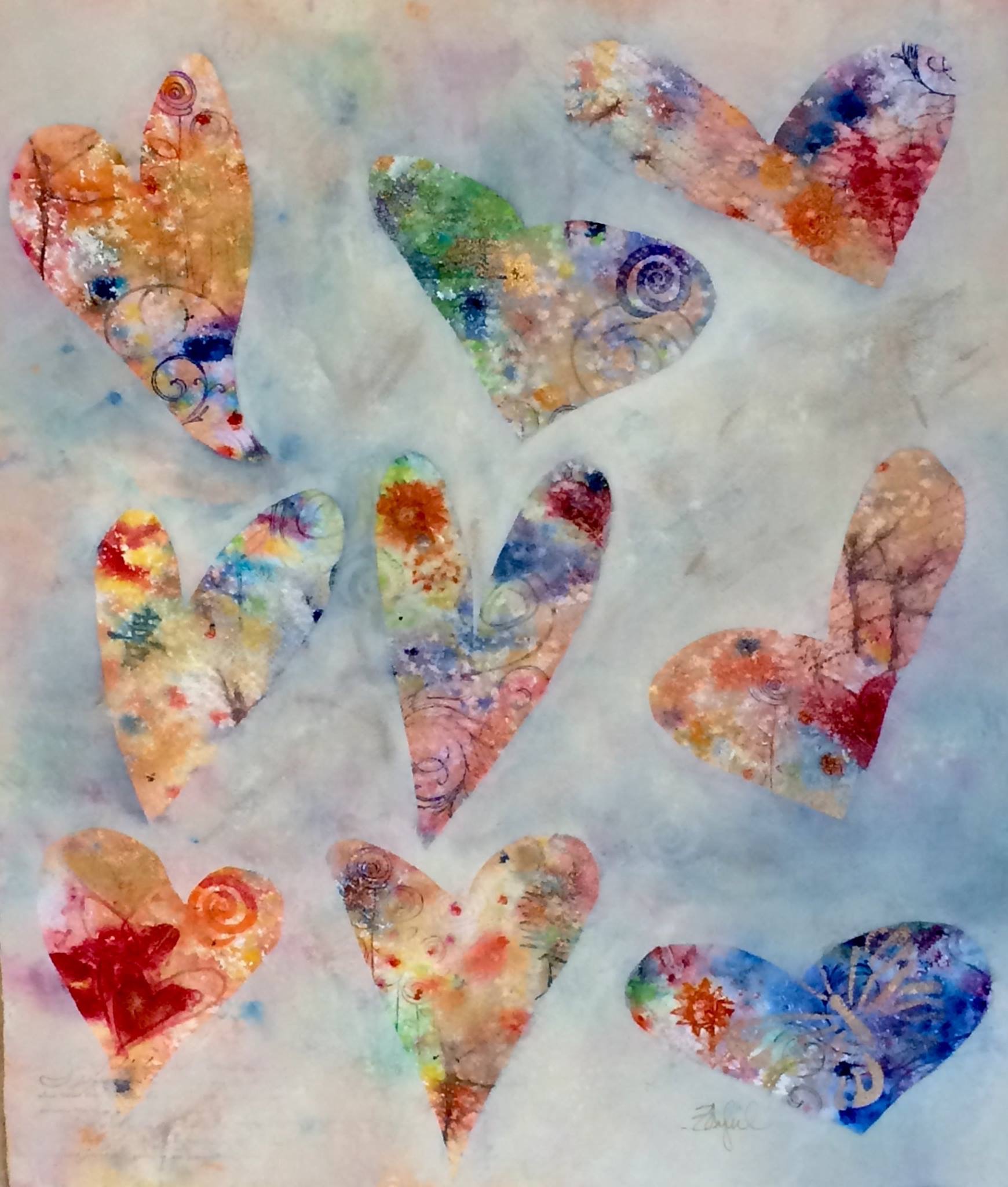
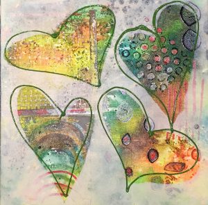
Recently, after doing this painting of abstract hearts I received a request for a commission. A very loving mom wanted a painting for herself and two of her daughters. She wanted them to each have a similar painting, but with each painting done using unique colors that she associated with herself and her girls. Isn’t that how we think of colors? We associate them with things or with people. We have colors in our closet that we wear all the time…over and over. There are other colors you would never dream of wearing…they’re just not YOU.
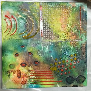
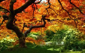 As she described the color palette she wanted for each of the paintings, I decided to find a visual reference to use for each painting. The first painting was to be warm and earthy, but colorful. I looked around and came up with this photo as a reference for a palette I thought was beautiful and in keeping with her idea.
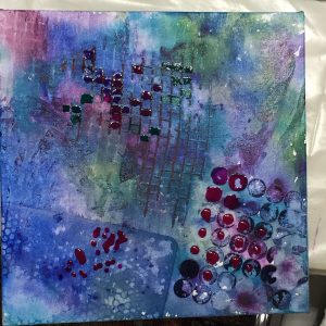
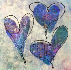
 The next painting was to be in jewel tones. I looked around and thought the colors in this image were really gorgeous.
This is a method I will use occasionally when I want to have a color goal for my painting. I use google images, or some search engine and plug in the colors I’m interested into the search box. It’s interesting to see what comes up, and sometimes you get really drawn to certain color combinations. Those are the ones that will likely become my color inspiration swatches. I don’t always do this, but it may be something for you to try…
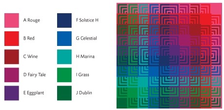
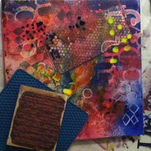
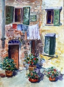
The 3rd painting was going to be in primary tones of red, blue and yellow. I decided to use a fabric swatch for color inspiration.
Using 3 primaries (lemon yellow, red, and blue) . My goal was to build layers and mystery in to the surface. The first step used acrylics on canvas with ink and paint.

Water was used to create organic movement and mixing. I left stencils and texturizing materials in the surface when wet and allowed them to dry while in contact with the paint. Next I would layer more paint using more stencils and various application methods including mouth atomizing. I chose letters that might be meaningful to the person involved and tried to come up with surprises on the surface and in the color mixing.
I kept building layers and pushing the colors to get
more contrast and more surprise. As you can see in this next photo, I didn’t try to exert a lot of control, but instead tried to push it and pull it in a very loose and intuitive way. I used alcohol, stamping materials and various hardware things I keep in the studio for creating pattern and texture. Sink mats, hot pads, screen material…you name it, I might have used it in my painting.
The same sort of beginning was made for these two paintings. Note the very loose use of pattern and color. However, don’t confuse loose color with thoughtless or careless color. Both of these paintings have color plans based on the photographic references I showed you earlier in this post.
My marks may look random, but they are not. In making marks, I have a mantra in my head that is repeated over and over:
- Repetition with variation
- Harmony with variety
- Similar but different
- Change something but not everything
- Change scale of shapes- Papa bear, Mama bear, baby bear
- Change direction of shapes
- Create color paths to help move the eye through the painting
Those of you who have studied with me know that these concepts are recurring themes when we speak about design. These ideas are always important to keep in mind.
Since this commission was a group of work, the final paintings needed to be similar. So, I painted negatively using the same neutral color (titan buff) to create harmony between all three paintings. Hearts were the unifying symbol between all the paintings, so I added them using different directions and spacing. I chose numbers that I associated with each of the individuals involved, and then had some fun embellishing each piece with some loose calligraphic lines. Those lines were similar but different. This concept is always at the forefront of my choices as paintings develop. This mantra is especially important in abstract painting, but it’s equally useful in representational work. Thinking about these things is fundamental to good design. Try it on your next painting!
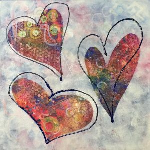
The final paintings ended up being unique and in keeping with my original idea…kind of. Sure, I had a plan. That plan gave me an idea of where I was going, but it didn’t necessarily dictate where I ended up. Different choices can always be made along the way. If you don’t tend to plan before you launch into painting, you may want to try this method of selecting a color palette prior to beginning. Keep my mantra in mind as you paint and send me a photo of your results! I’d love to see what you do with this idea…
How about a little painting adventure???!!
I would love to have you play in the paint with me and add a little adventure to the process. How about joining me in Tuscany for my EAT PAINT COOK TOUR of TUSCANY 2016? There are still a few spots left and Tuscany is the perfect place to go and avoid any high risk European cities. We prefer the sleepy and scenic Tuscan countryside…perfect for relaxation and beautiful scenery (as well as GREAT gourmet food and wine). Click here and view the complete brochure. https://rebeccazartist.com/eat-paint-cook-tour-of-tuscany/
Happy Painting y’all!
Rebecca, I love the pictures. Thanks for sharing your process and your ideas. I can’t wait to try this in January!
Hi Barb, I’m glad you enjoyed the blog, and I’d love to show you this process when you get back in town. We are missing you! Thanks for checking in… Love, Rebecca <3
What a great commission to get, Rebecca! Those are beautiful paintings. Thank you for the “mantra” too.
Hi Maggie, thanks for checking in! I use that mantra in every painting I do. I hope sharing it can help you with future paintings. ?