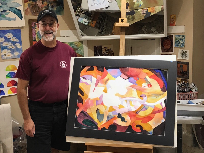
Lessons from August’s Amazing Abstract Workshop
As often happens in August and September, I teach right up until it’s time to go to Italy with my Eat Paint Cook Tours. That doesn’t leave time to write about what goes on over the summer during classes and workshops. But! I’m going to take a moment to share about Augusts’s Amazing Abstract Workshop… basically because there’s SO MUCH!! And it’s good stuff!! The week-long abstract workshop was chock full of “aha” moments and lessons for all of us.
During the workshop, I showed a number of powerpoint presentations on design/composition and color. Students really seemed to get a lot out of them. I think pictures help learning for many of us. As artists we are often visual learners. So, building on that experience, I thought I’d share lots of pictures with you today, and use them to help illustrate many of the topics we covered. That way, those of you who couldn’t be with us for the abstract workshop will still have a chance to think about some of these topics. 😊
“Similar but Different” or “Repetition with Variation” Principle
Basically this principle hinges on the idea that as artists, we should always be looking for ways to create variations whenever we need to repeat ourselves. Repetition is a good thing. It brings harmony and makes our paintings hold together, BUT like many good things, too much can be a problem.
Too much repetition without variation is dangerous! All too easily, our repetition becomes boring 😴. THAT my friends, is something we want to avoid at all cost!!
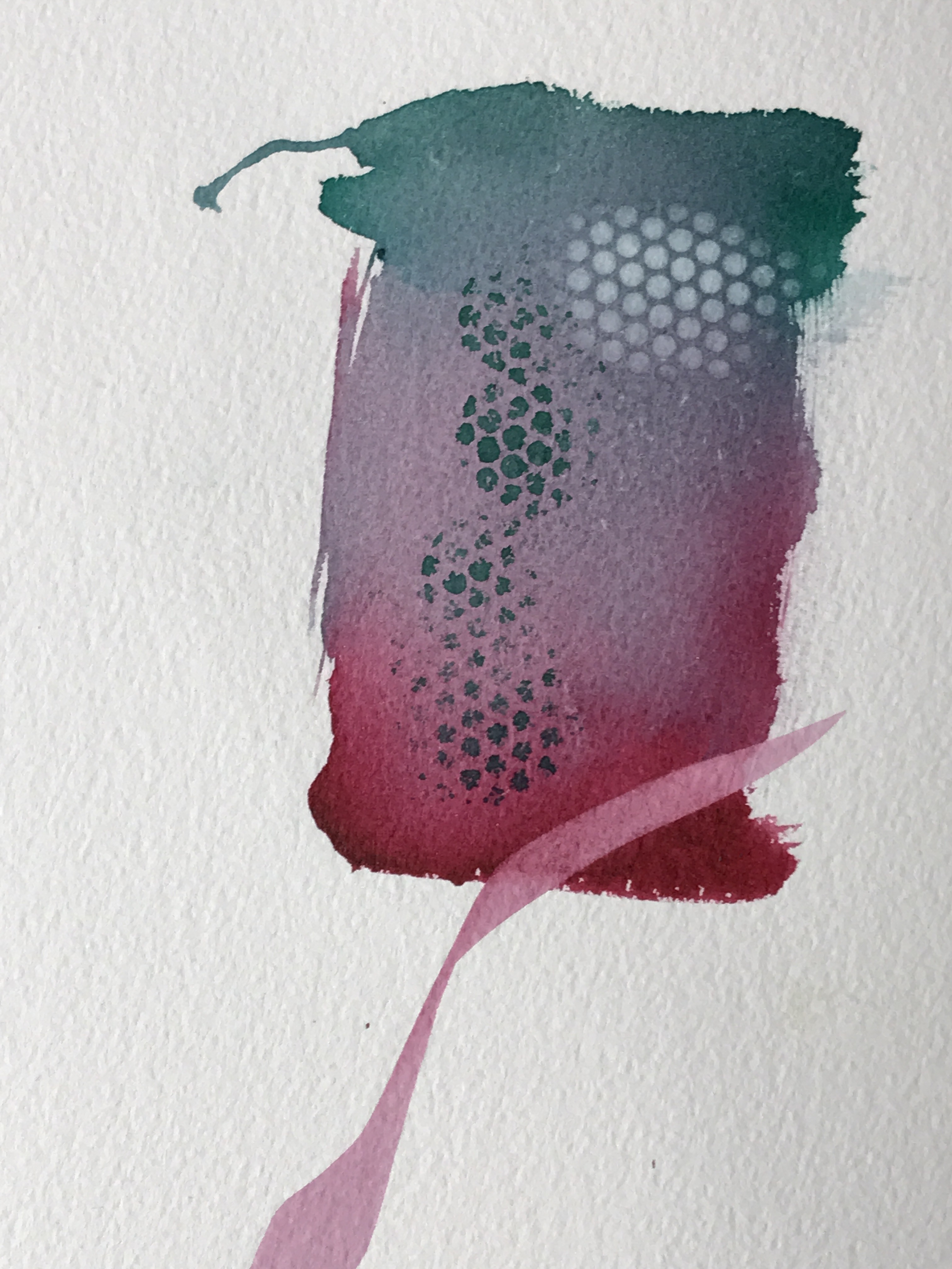
You can see that the dotted pattern above is repeated, but with changes. It’s not static. The shape of the pattern varies and the color shifts. It goes from being a positively painted pattern (green dots) into being a negatively lifted version of itself (white dots). All these variations make the pattern more visually interesting.
That’s something that doesn’t just happen. As artists, we have to make it happen.
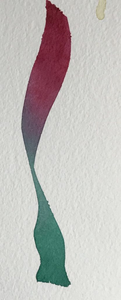
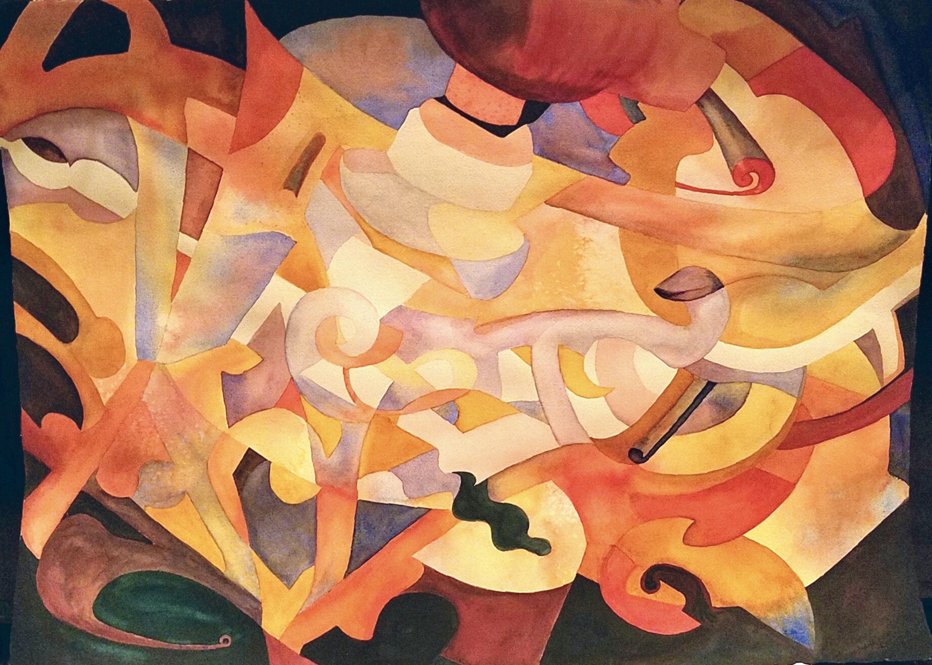
The photo above is a demonstration of taking a line and using the same variation principle while painting a line. Not only does the line above have variations in width, but it also varies in direction and color. All that variety transforms this from a boring line to an interesting one.
Remember the idea is to always look for ways to spice things up! 😉💥Don’t just create a line…make it a better line using variation!
Creating Texture or Pattern in Watercolor
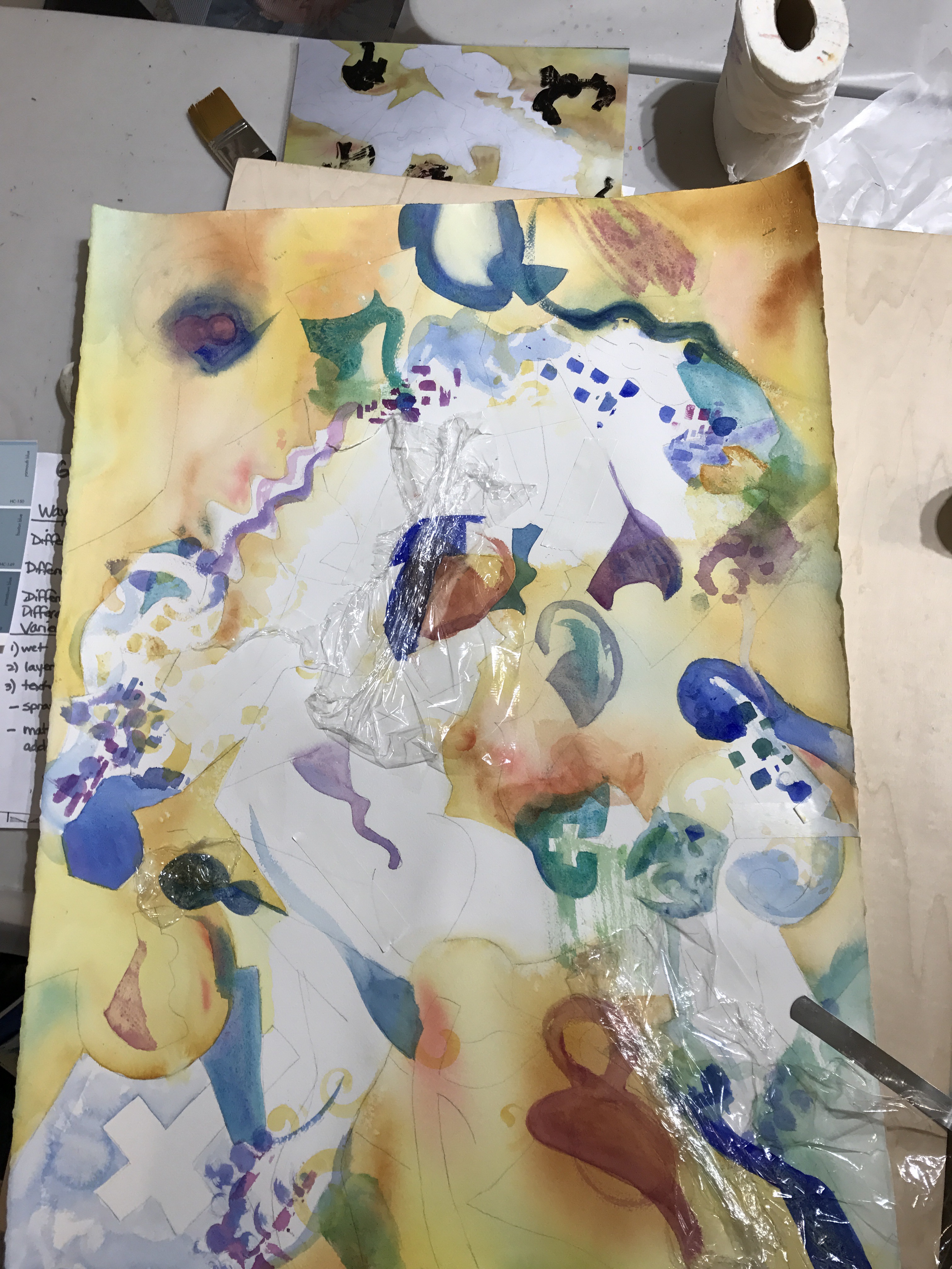
Texture or pattern is another realm of design we explored in our abstracts. Mark making and embedding wet paint with texturing materials are positive ways to create patterns and give a textured appearance to the surface. You can see both techniques in the photo above taken early in the development of Ginny Ward’s Abstract. She has used different brushes and created unique marks that have similar colors, but variation in shape and direction. She also laid saran wrap into areas of wet paint to make other pattered marks when they dry.
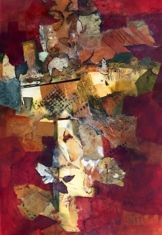
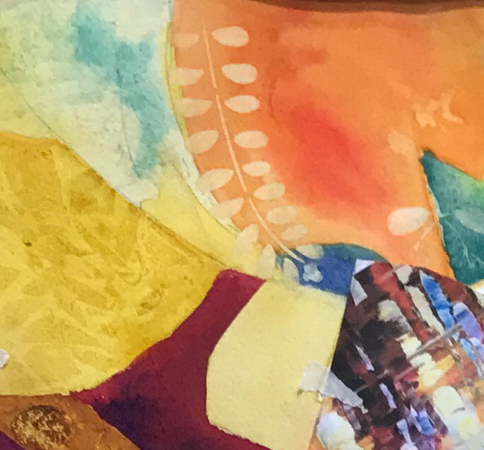
Below is a detail shot of Robin Livingston’s luscious painting. She explored pattern and texture multiple ways in her piece. Here she lifted (orange light colored leaves), laid texture into wet paint (yellow textured area), and added collage (the multicolored patch in the right lower corner). So many fun things to exp!ore when we free ourselves up from the need to make our paintings look like something!
MAKING A COLOR PLAN
One advantage of a more intensive workshop vs. regular classes is having time to do some preparation and planning. I’m smiling as I write this, but you know what? Planning can help! And, in my experience, it’s very rare that you learn how to plan your own paintings in a class. So often you show up and the teacher has done all of the planning for you. Then you wonder why it is that can’t seem to be as successful on your own when you go home?! 🤔 Planning may be the reason.
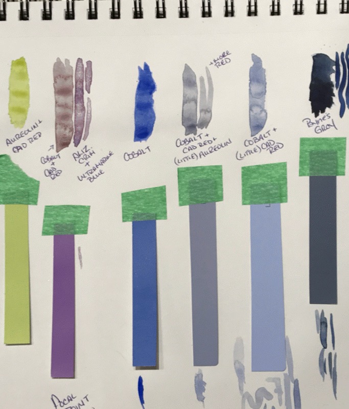
Below, you’ll see a planning page from Heidi’s sketchbook. She decided on a dominantly cool/neutral color plan.
Using one of my sets of color swatches, she took her paint palette and tried to match the colors.
Taking notes of what colors she used, she recorded them on this page. I highly encourage you to take notes on your paintings. That way, you can remember what you learned and have the notes to refer to if you want to try it again. 💫
Speaking of color plans, I had everyone decide on a temperature dominance for their paintings. Why? Because of another principle:
The Dominance Principle
When you make dominant choices, you create a sense of harmony in your paintings.
For example, Heidi made the basic color decision for a dominantly cool (vs. dominantly warm) plan. (above) You can note that her color choices are dominantly cool (leaning toward blue), with just a little sense of warmth coming from the yellow/green and the red/violet.
Those colors that are not cool seem remarkable. That unexpected quality lends itself to catching your eye. That makes sense, right? In a sea of cool colors, a pop of warm color will stand out. This is why the violet or the yellow green will lend itself to being used near a center of interest, or focal point.
Free Yourself UP! Try painting an Abstract! 🌈🎈(You don’t have to attend an abstract workshop to give it a try!)
Representational imagery can feel like a prison sometimes. The need to make it look “real” can constrain so many of our painting possibilities. If you’ve never tried abstract art, I encourage you to give it a go! You may discover that there’s a lot you don’t know that deserves your attention.
I think it’s similar to music. If you’ve ever tried to play an instrument, you develop a whole new respect for those who do it well. By trying your hand at abstract art, you may develop a whole new appreciation for this vast and contemporary branch of the art world.
Another huge reward for studying this branch of painting is this:
The principles I teach in my abstract workshop will also make you a better realistic painter!
How? These principles are about design fundamentals and well designed paintings are usually successful!
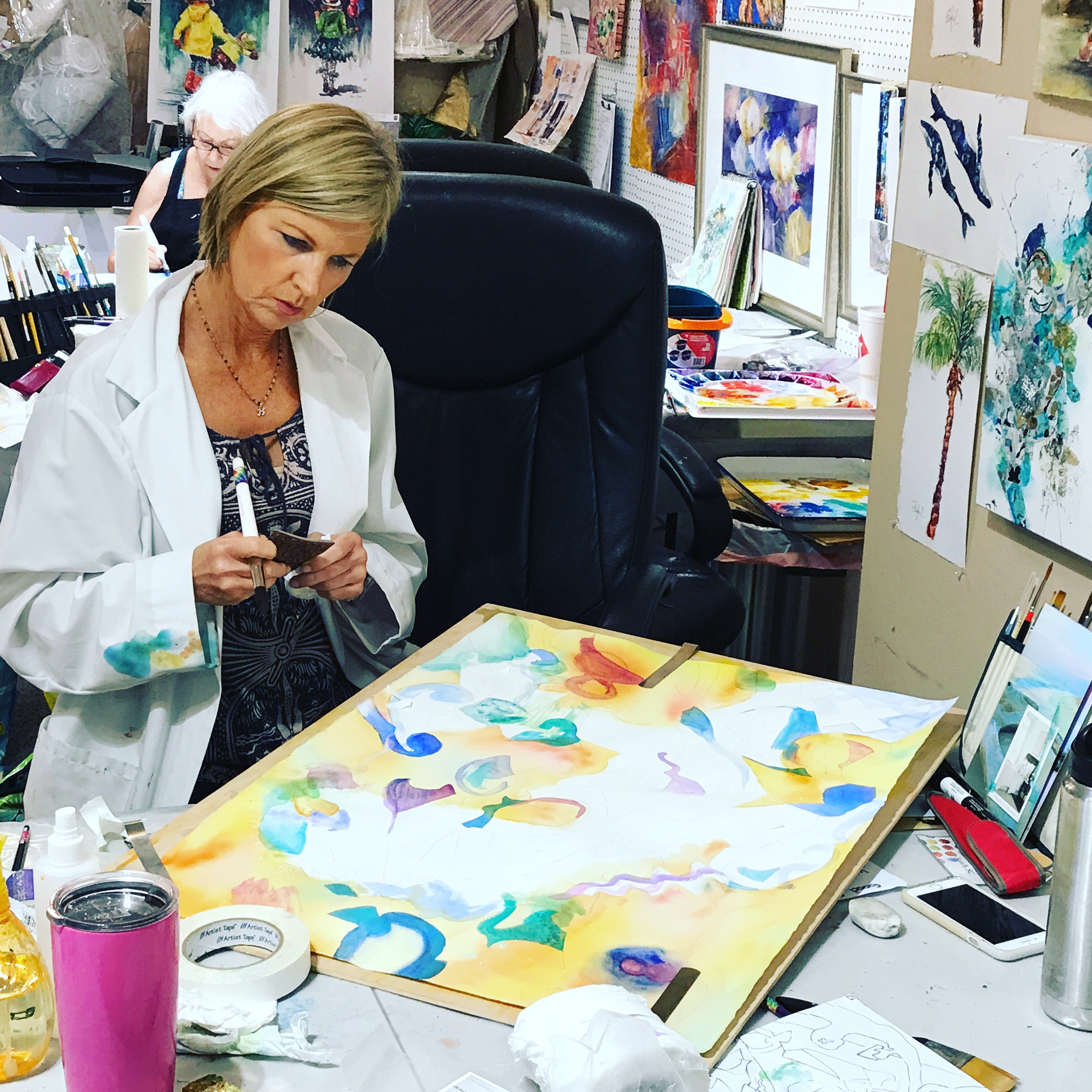
Enjoy a few more images of our workshop and think about joining me in the future for an intensive workshop.
If you enjoyed this article or learned something, I hope you’ll share it on Facebook, leave a comment or email me. I love turning these articles into a conversation.
With love and light,
Rebecca Z
Share Love❤️Spread Light☀️Do Art🎨Give Back💫
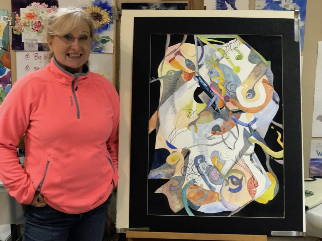
Making decisions takes a lot of thought. Who said abstract art is easy???!!! 🤔😉
Ginny’s warm underpainting from the previous photo lends a subtle glow to her dominantly cool (almost) finished painting. Love it!

Suzy’s love of color really shows in her bold piece! So fun to see the artist place their personal stamp on a painting! Well done!
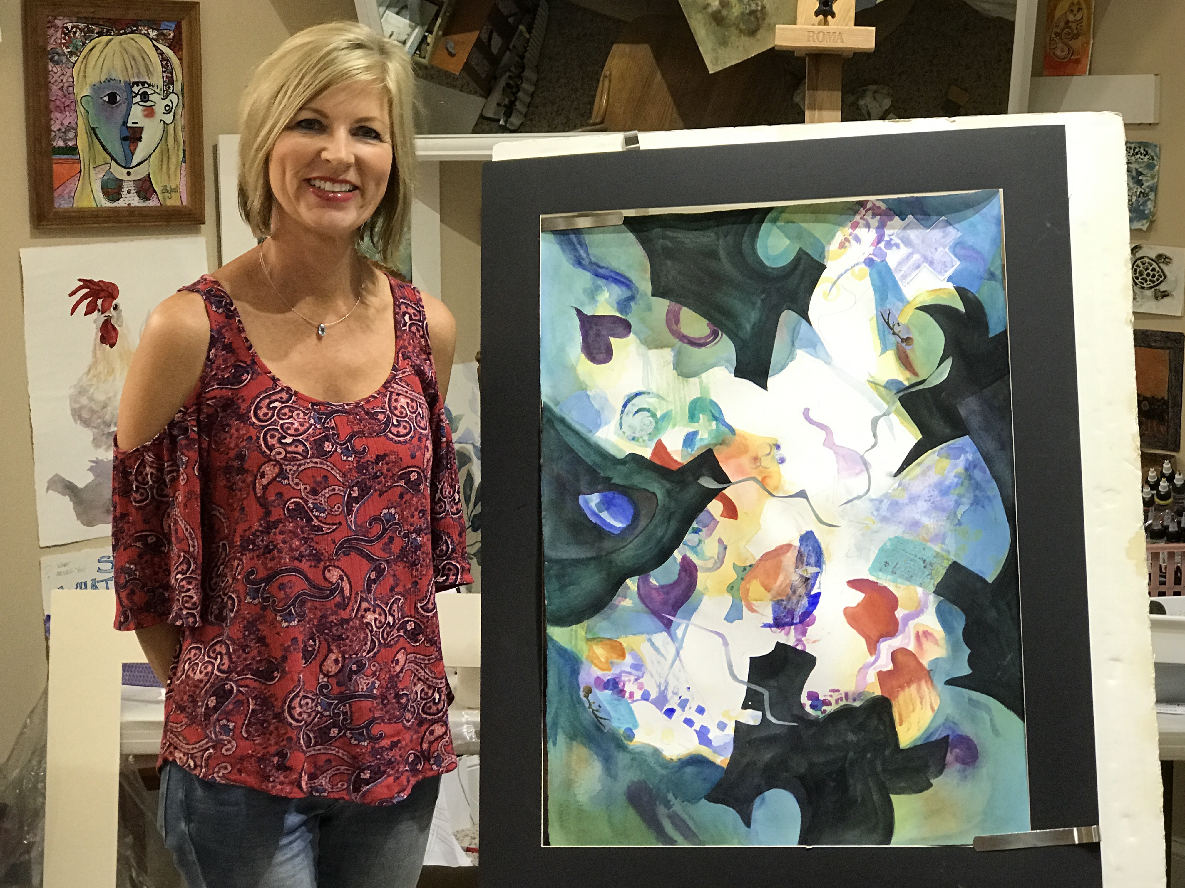
Rita is a beginning painter and powered through her anxieties with trust in the process. I think this painting is one to be proud of! This would be an example of a “Frame within a Frame” compositional design.
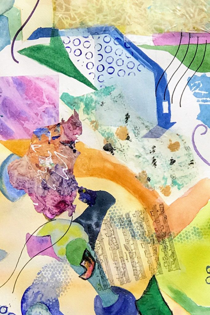
Above is a detail shot of a small section of Rita’s painting. Lots of techniques ranging from stamping, to mark making, to collage and lines made with stencils…all kinds of playful applications of paint! 😊
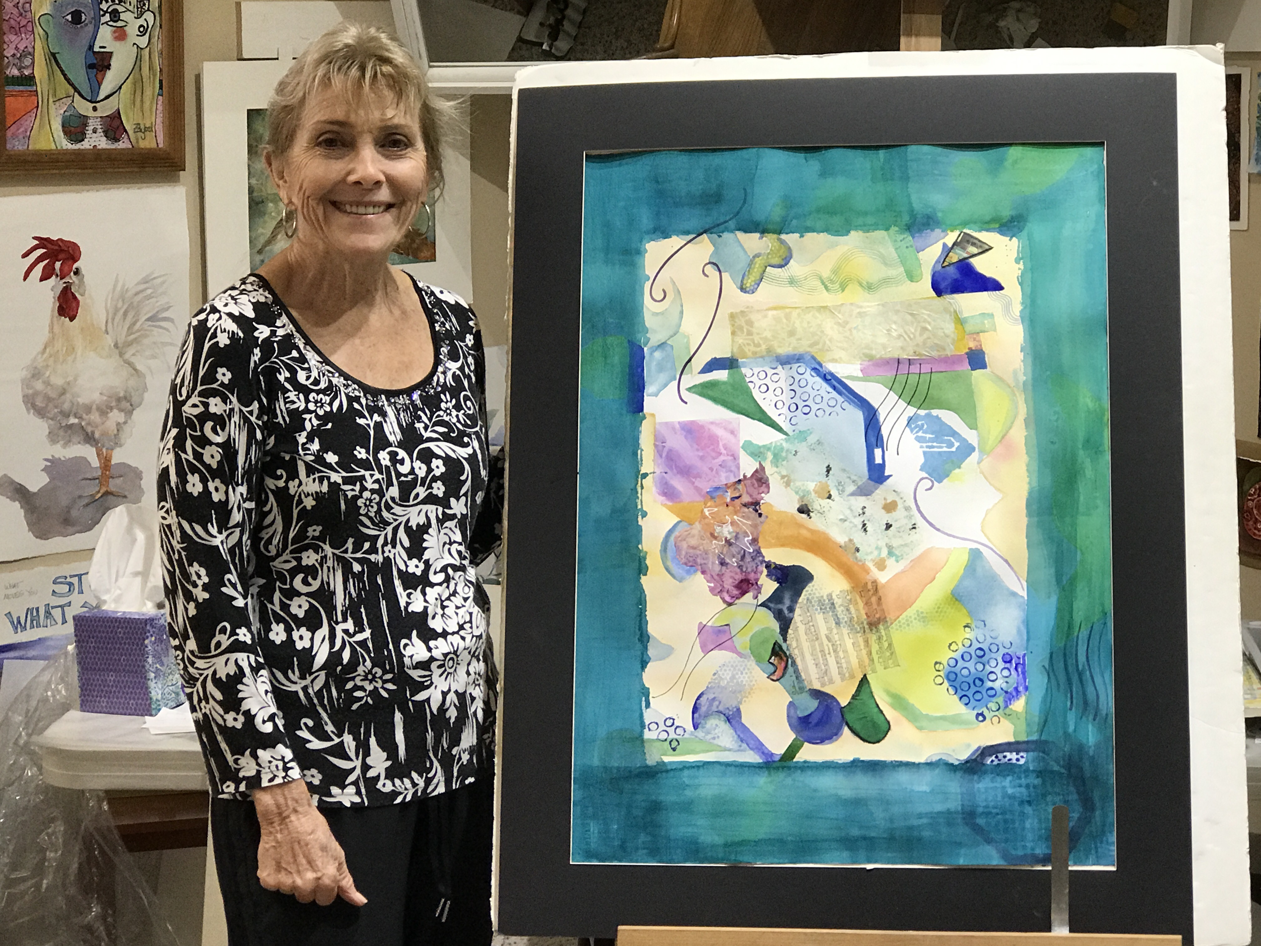
Heidi also used a “Frame within a Frame” composition to organize her painting. The cool and somewhat neutralized palette has a some warm tones as relief. Her focal area employs a bright pop of orange as a complimentary contrast to all the blue in her piece. She also brings the black from the surrounding frame into the focal area with a dark circular form. The complimentary color and the circular form with sharp value contrast all tell you to “look here”. Super job Heidi!
Dan Kraus is a natural planner, and used organic shapes with a warm dominance. You see a little bit of violet as a cool contrast in this early stage of the painting.
The finished piece. Fantastic!
Rebecca, I learned so much from reading this post. The paintings are wonderful. All your students should be happy with their accomplishments. This is a post that I will definitely reread. Chock full of techniques! Thank you. Kat
Thanks for the feedback Kat! Glad you feel as if it going to be helpful for you ❤️ Hope to see you soon. Xo