
“Starting is easy, finishing is HARD.” Ever heard that said? Ever said it yourself? Have you ever finished a painting and said,”Hmmm, that’s not quite right, but I’m not sure what to do next?” If I had to say the number one reason my students come to me and continue to study with me, that’s it. They have trouble figuring out how to make their work better. We all get into trouble (some of us more than others!), but finding someone whose judgement you trust, or who has good ideas and methods for how to get out of trouble can be difficult. Today I’m going to share one example of the process I used to take a painting from it’s beginnings and through the final finishing edits. My hope is it will help you to hear about my methods. Sharing my methods and helping students learn how to improve their odds for success is what I love to do. <3
Materials:
- Arches 140 lb. paper. I use the loose sheets, because I have found them to be of better quality than the paper pressed into the Arches pads.
- This painting below began as a pen sketch using a marker I love to use on location. It’s a black Elegant Writer marker…cheap, archival, water-soluble and available at any local craft store. What I love is that once the ink has been “activated” by water, it will become permanent and you can then paint over it without further bleeding. This takes some restraint when you first put down the ink…knowing that you can always add more. It also helps to use the extra fine nib. The ink will bleed green and pink when water activates it. The pink will come out when you dab and lift the wet ink from the surface. Try it! You’ll love it!
- Watercolors
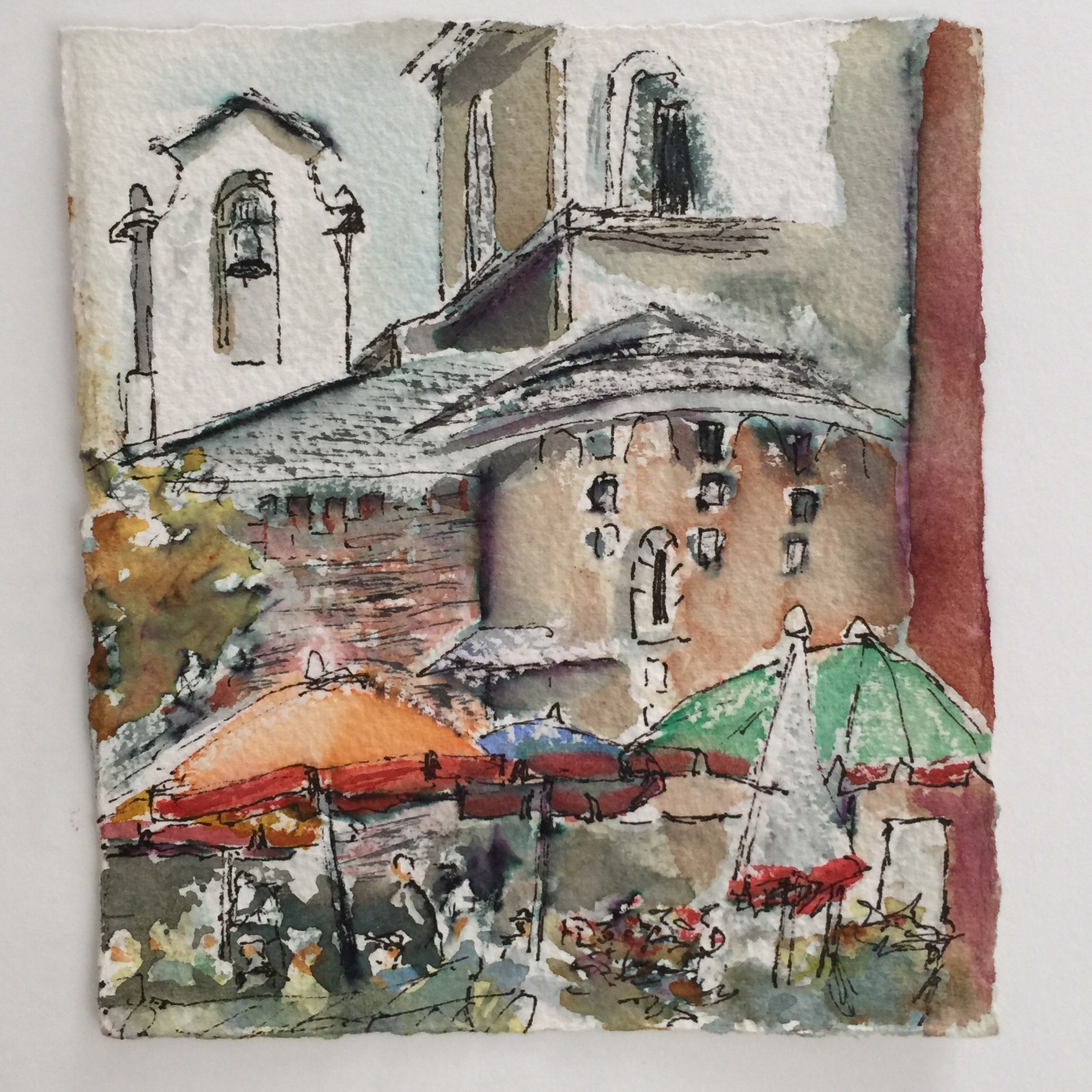
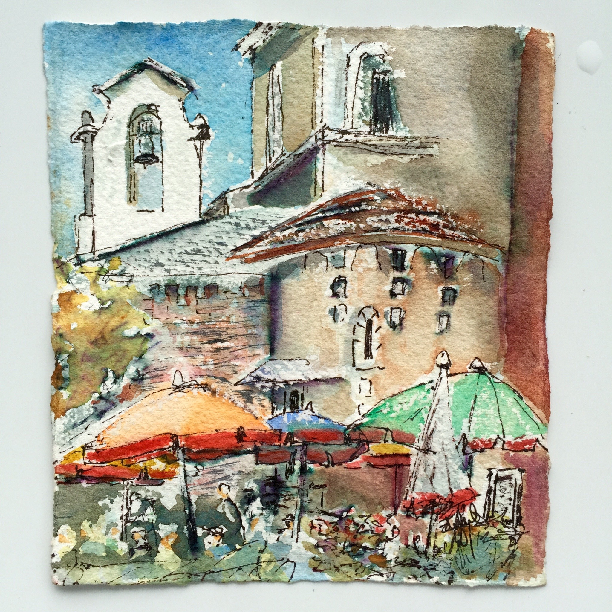
SKETCH 1- ON LOCATION WITHOUT EDITING
ITALY
Hint #1- PAINT!
I’m not kidding (well I kind of am) but there is no amount of studying that can substitute for painting. Take the risk of creating a stinker. So what if you ruin a piece of paper? What’s the big deal? All you risk is…wait for it…your EGO! The bottom line is, that unless you paint, you will never know whether or not you end up with the best painting of your life. Like the Nike ad said: Just DO IT! You will see yourself improve, learning lessons from each painting. When I begin a painting I never know if will be any good. I’m being honest here. Some of them are winners, some of them…well, not so much. I will say that the general rule is that the more paintings you create, the greater the odds of success. It makes sense, right?
Not every instructor works in the same way. If you want an instructor who is selling their mystique, their persona and their work…someone to ooh, and ahh over while you sit and watch them paint so you can buy their $400 demo, and begin a painting in the remaining portion of your time with them, then I’m not your teacher. I want to get to know you, and help you be the best artist you can be, and in the end to help you succeed. As someone who has come to art later in life and found a way to do it professionally, I have studied with many of today’s “hot” instructors. They can all show you how they paint and how to start a painting, but there is one thing that even the best instructors rarely show you…That is how to FINISH a painting. Which brings me to:
Hint #2- Find something you love about your painting.
The painting above, done on location in Italy was fun and I loved it’s freshness. In life and in art: Once you find that thing you love, hold onto it! Keep that thought in mind as you edit. Exaggerate what you love and try not to lose it.
Hint #3- What bothers you most?
This seems contradictory to #2 but it isn’t. Again, in life and in art, I’ve often found that sometimes it’s easier to know what makes you unhappy, than what will make you happy. Anyone else feel that way? So start there. In your quest for happiness (which is what our editing is all about in the end), start by eliminating what makes you unhappy. Ohhhhmmm. Are you feeling the zen? Maybe I should have titled this blog Zen and the Art of Painting Maintenance. But let’s get back to the subject at hand…
Personal Critique of above painting: In this case, I was not a fan of the sky and all the white at the top of the painting. So…I put in a sky to bring out the pretty bell tower and make it a bit more prominent. After adding it, I liked it better. I also noticed that I had “missed” an umbrella peeking in under the green umbrella, so I added some color there to bring it out.
Here’s what it looked like after those changes:
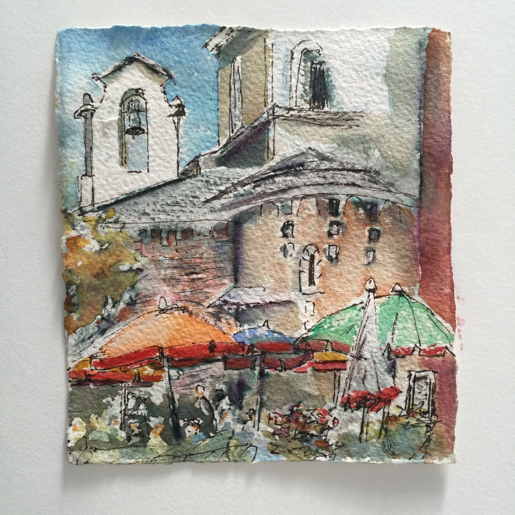
Same painting after 1st edit- addition of sky and yellow umbrella
Hint #4- What’s the Point?
Ask yourself why did you paint this in the first place? What’s the point? In the painting above my point was the beautiful umbrellas and the celebratory feeling of color and people in front of me. Does your painting support the feeling you want to convey, or the story you want people to take away from the it?
Personal Critique of above painting: Hmmm, as I looked at the painting, my eye doesn’t want to settle on the umbrellas…in fact my eye keeps getting trapped in the Right upper corner. Does that happen for you when you look at it? Why is that ?
Hint #5: Asses the VALUEs
When there is a problem with the painting, I always think first of VALUE. What is value? Light and Dark. The strongest statement we can make as an artist is to put light against dark. It attracts our eyes more than color, more than lines, more than anything. Wherever there is black against white, we will be forced to look.
Personal Critique of above painting: For me the problem seems that the dark window against the light building is too visually demanding, and ends up being a distraction from my subject (the umbrellas). On location, that was the value pattern, but this is the beauty of being an artist. Yay!! We are not slaves to reality (which sometimes bites, in case you haven’t noticed 😉 We are masters of our own painting universe…and it’s our job to make our reality support our own vision.
So, I need to change that value…and I did. I also thought the roof of the round building in front was reading flat, and I wanted it to come forward. So I put a warmer color on it (remember that warm colors come forward and cooler colors recede). After those changes the painting looked like this:
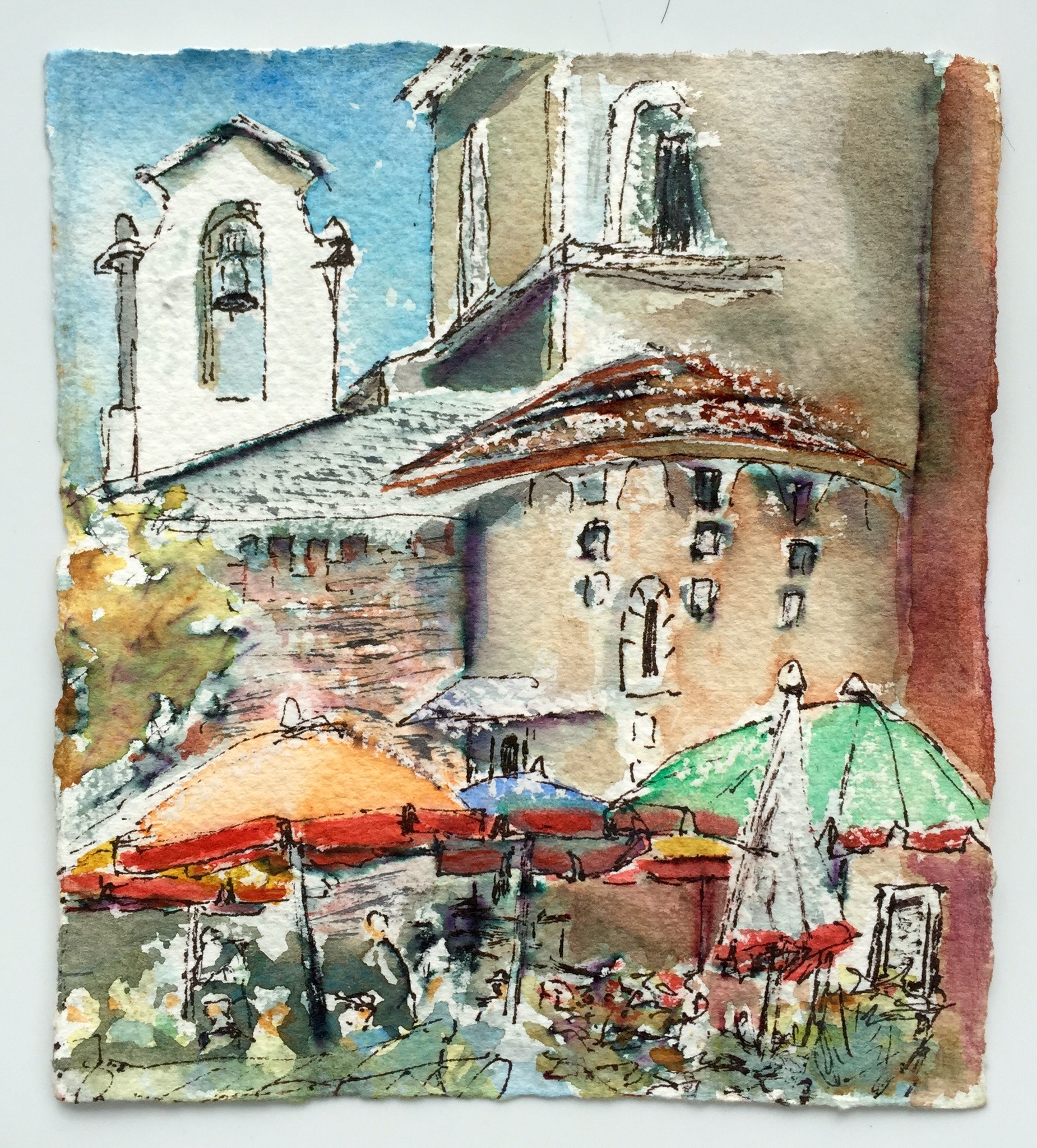
The darkened building seems to make the window less visually demanding and my eye now comes forward to the umbrellas more easily. The roof is also more 3-D with the addition of color. I’m liking it better now.
Hint #6- Add Detail if needed, but Don’t Say too Much!
I like a little bit of mystery in paintings. That which attracts me the most is that which intrigues me the most. There’s nothing more dull to me than too much detail. However, sometimes the addition of a little detail can help, especially in the area of visual dominance. So if you look closely at the image above, I added the smallest bit of black ink detail against the white at the top of the blue umbrella. The detail under the awning of the round building supports the focus remaining at the bottom of the painting. The fact that there is black against white also puts value to good use. I used my pen on top of the watercolor for this addition.
Hint #6- Sign it
Thoughts on your signature:
- Use something to sign that you used to paint…e.g.archival pen (as I did here), graphite, paint of a color that is familiar to the painting.
- Sign it at least 1 inch away from the edge. If you have a name with a letter which “dips below the line on which you write” then sign it higher. Putting a piece of tape along the edge and signing above it can be helpful.
- Sometimes I will sign in graphite and then paint over it for a more natural looking line
- If you’re a woman, there is evidence of gender bias among those who judge art or buy art. I hate that this is still an issue, but we are only human. If you want to eliminate any possibility of this sort of thing, you may want to consider a “gender neutral” signature.
Signed and Finished after editing complete!
I hope today finds you inspired to paint, or maybe pull out an unfinished painting and bring it across the finish line with these hints on how to edit. If you’d like my help in the process, come with me on a future art adventure, or come to class with me. Art has brought me such joy, and there’s nothing better than having the opportunity to share that joy with other like minded souls!!
Speaking of arty adventures: I’m currently on the Amalfi coast and this was the scene I woke up to today:
Buon giorno y’all!
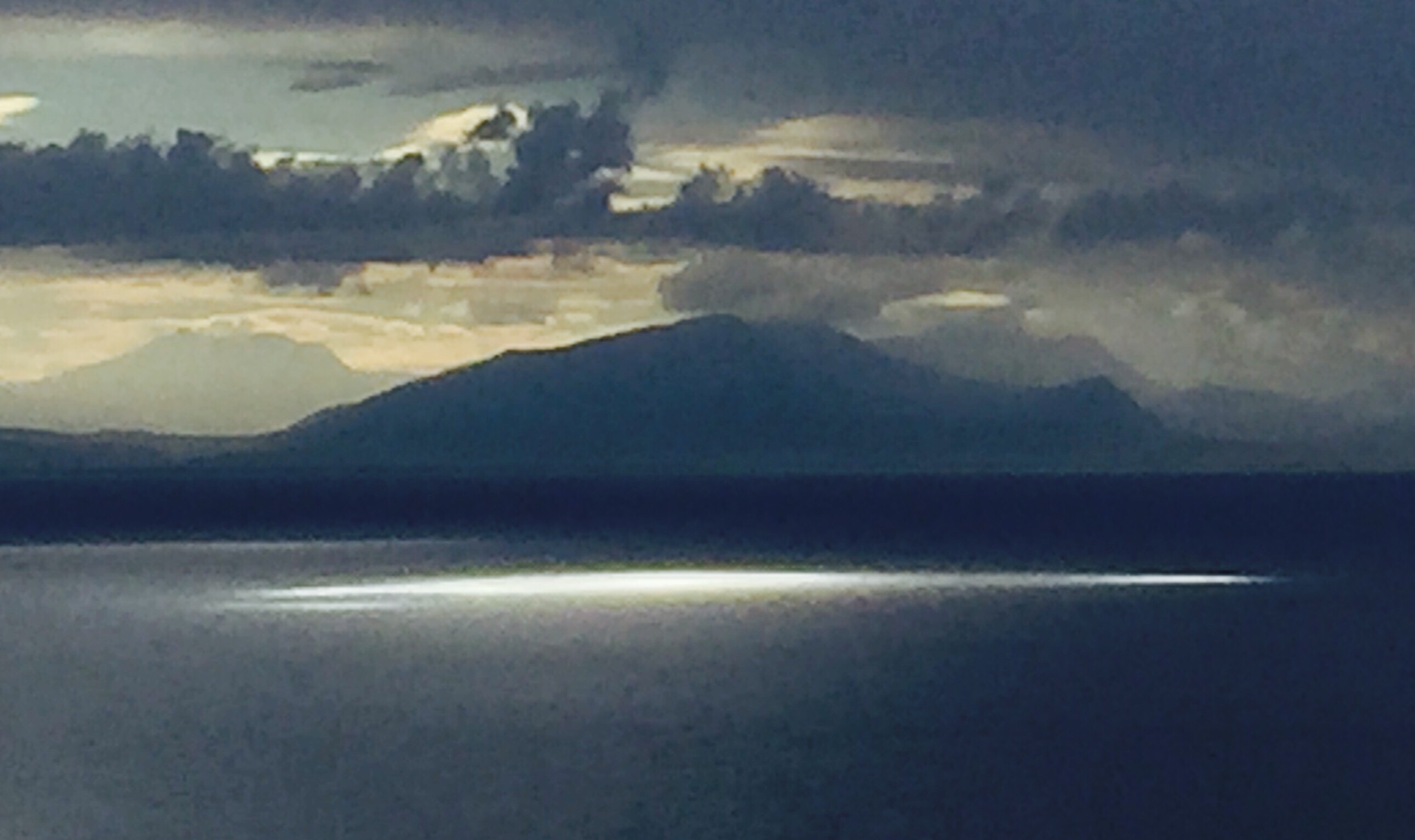
Amalfi Morning
I offer classes and workshops in Myrtle Beach, SC. If you’d like to join me for your own Arty Adventure, how about next year’s workshop in beautiful Tuscany?, Sign up today for my Eat Paint Cook Tour of Tuscany 2016. Dates are Sept 24-Oct 1, 2016 and I’d love to show you my favorite spots in this beautiful region of Tuscany. The brochure is available on my website, under “Classes and Travel” or click here! Eat Paint Cook Tour of Tuscany 2016- details here Subscribe to this blog and you’ll be able to join us vicariously on this year’s Tour.
Stay tuned and Stay in Touch!
Great useful encouraging article Rebecca, as usual. I am prepping my “kit” to go to Europe for 6 weeks and traveling very light is a major commitment… Planning basically a small watercolor sketch book (handmade one I bought in Venice last year that has a “tab” on the spine side of every page that I can add a page with… hope that makes sense. The paper is good enough quality for sketching and light watercolor and the number of pages just right for my trip.
Also prepping some post cards.. just ordered Tim Holtz Post Card acrylic stamp set to set them up. That way I will “off load” work to friends and family as I go…
One of my many favorite things about your teaching is summed up in your words today.. you encourage us to improve on what we do and don’t try to fit us into your shoes.
Love your morning view… so so happy for you to be having this time.
Dip those brushes in the Mediterranean..
I’d like to see that Tim Holtz acrylic stamp kit! There is sot much fun stuff out there it’s hard to keep up! Thanks for your encouragement and friendship. If I miss you before you go, have a wonderful time! ✈️?❤️
Thanks Rebecca for sharing this great lesson…even on your vacation! I always value and appreciate your suggestions. I follow your blog with great interest. The photos and pictures of your art are very inspiring. Enjoy the rest of your trip and please reserve my winter space in your class in Myrtle Beach. One day I will get to Europe! Barb
Can’t wait to welcome you back Barb!i love having you with me, if only virtually! I hope you’re painting!!! ❤️
[…] PS- if you like this subject, you might enjoy reading this post: https://rebeccazartist.com/2015/09/how-to-finish-a-painting-from-good-to-better-to-best/ […]